Bootstrap 5 Exit Intent Popup Plugin - Exit Modal
| File Size: | 13.3 KB |
|---|---|
| Views Total: | 12987 |
| Last Update: | |
| Publish Date: | |
| Official Website: | Go to website |
| License: | MIT |
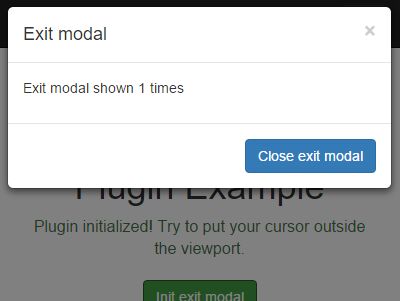
Exit Modal is a lightweight JavaScript plugin that detects user exit intent and triggers a Bootstrap 5 modal the moment a visitor's cursor moves toward the top of the browser viewport.
It monitors mousemove, mouseout, and mouseleave events to catch the instant someone reaches for the browser toolbar or a new tab. Works both in jQuery and Vanilla JS projects.
Features:
- Detects upward mouse movement toward the browser UI.
- Integrates natively with Bootstrap 5 modals.
- Limits the number of times the popup appears per session.
- Fires custom callback functions during the modal lifecycle.
- Requires zero external dependencies beyond Bootstrap.
Use Cases:
- Displaying a special discount code when a user attempts to abandon a shopping cart.
- Prompting visitors to subscribe to a newsletter before they close the blog tab.
- Warning users about unsaved form data when they move their cursor toward the back button.
- Asking for quick feedback or a rating right before the user leaves a documentation page.
How to use it:
1. Load the Exit Modal plugin after the Bootstrap bundle.
<!-- Bootstrap 5 CSS -->
<link rel="stylesheet" href="https://cdn.jsdelivr.net/npm/bootstrap@5/dist/css/bootstrap.min.css" />

<!-- Bootstrap 5 JS Bundle (Popper included) -->
<script src="https://cdn.jsdelivr.net/npm/bootstrap@5/dist/js/bootstrap.bundle.min.js"></script>

<!-- Vanilla JS version of Exit Modal -->
<script src="exit-modal.vanilla.js"></script>

<!-- jQuery version — load jQuery first, then the plugin -->
<!-- <script src="jquery.min.js"></script>           -->
<!-- <script src="jquery.exit-modal.js"></script>    -->
2. Build your Bootstrap modal. Add the exit-modal class to the outermost modal <div>. Exit Modal targets this element during initialization. Attach data-exit-close to any button you want to treat as an exit-modal close trigger.
<div class="modal fade exit-modal" tabindex="-1" aria-hidden="true">
  <div class="modal-dialog modal-dialog-centered">
    <div class="modal-content">
      <div class="modal-header">
        <h5 class="modal-title">Before You Go</h5>
        <!-- data-exit-close marks this as an exit-modal close trigger -->
        <button
          type="button"
          class="btn-close"
          data-bs-dismiss="modal"
          aria-label="Close"
          data-exit-close
        ></button>
      </div>
      <div class="modal-body">
        <p class="mb-2">We saved something just for you.</p>
        <!-- Update this element dynamically via the callbackOnModalShown callback -->
        <p class="mb-0">Current offer: <span id="currentOffer">15% off your first order</span></p>
      </div>
      <div class="modal-footer">
        <!-- Dismiss re-arms exit detection after the modal closes -->
        <button
          type="button"
          class="btn btn-outline-secondary"
          data-bs-dismiss="modal"
          data-exit-close
        >No Thanks</button>
        <!-- CTA to retain the user on the page -->
        <button type="button" class="btn btn-primary" id="btnClaimOffer">Claim Offer</button>
      </div>
    </div>
  </div>
</div>
3. Initialize Exit Modal.
// Vanilla JavaScript

// Select the modal element by its class
const modalEl = document.querySelector('.exit-modal');

// Instantiate Exit Modal with custom configuration
const exitModal = new ExitModal(modalEl, {
  pageYValueForEventFired: 15,      // Trigger when cursor is within 15px of the viewport top
  numberToShown: 2,                 // Show the modal at most 2 times per session
  modalBackdrop: true,              // Display Bootstrap's overlay backdrop
  modalKeyboard: true,              // Pressing Escape closes the modal
  callbackOnModalShow: function() {
    // Fires the moment the modal starts opening
    console.log('Exit intent detected — modal is opening');
  },
  callbackOnModalShown: function() {
    // Fires after the modal's opening transition completes
    document.getElementById('currentOffer').textContent = 'Use code EXIT15 for 15% off';
  },
  callbackOnModalHide: function() {
    // Fires when the modal begins closing
    console.log('Modal is closing');
  },
  callbackOnModalHidden: function() {
    // Fires after the modal fully closes and the backdrop is removed
    console.log('Modal closed. Detection re-armed.');
  }
});

// Attach mouse event listeners and activate exit intent detection
exitModal.init();
// jQuery Plugin
// Initialize Exit Modal on the target element via the jQuery plugin interface
$('.exit-modal').exitModal({
  pageYValueForEventFired: 15,      // Trigger within 15px of the viewport top
  numberToShown: 2,                 // Cap appearances at 2 per session
  callbackOnModalShow: function() {
    // Fires before the modal opens
    console.log('Exit Modal triggered');
  },
  callbackOnModalShown: function() {
    // Fires after the open animation completes
    $('#currentOffer').text('Use code EXIT15 for 15% off');
  },
  callbackOnModalHidden: function() {
    // Fires once the modal is fully closed and detection is re-armed
    console.log('Detection active again');
  }
});
4. Configuration Options. All options are available in both the Vanilla JS and jQuery versions.
viewportSelector(element | document): The target for mouse event binding. Defaults todocumentfor full-page detection. Pass any DOM element to scope detection to a specific container.showButtonClose(boolean): Shows or hides the modal's close button. Defaults totrue.showButtonCloseOnlyForMobile(boolean): Limits close button visibility to mobile viewports. Defaults totrue.pageYValueForEventFired(number): The pixel distance from the top of the viewport at which exit intent triggers. Defaults to10. Increase this value if detection feels unresponsive.numberToShown(number | false): The maximum number of times the modal can appear per session. Set tofalseto re-arm detection indefinitely on each close. Defaults tofalse.modalBackdrop(boolean): Passed directly to Bootstrap's Modalbackdropoption. Defaults totrue.modalKeyboard(boolean): Passed to Bootstrap's Modalkeyboardoption. Whentrue, pressing Escape closes the modal. Defaults totrue.callbackOnModalShow(function): Executes when theshow.bs.modalevent fires — before the opening animation starts.callbackOnModalShown(function): Executes when theshown.bs.modalevent fires — after the opening transition completes.callbackOnModalHide(function): Executes when thehide.bs.modalevent fires — before the closing animation starts.callbackOnModalHidden(function): Executes when thehidden.bs.modalevent fires — after the closing transition completes and the backdrop is fully removed.
{
  viewportSelector:               document,
  showButtonClose:                true,
  showButtonCloseOnlyForMobile:   true,
  pageYValueForEventFired:        10,
  numberToShown:                  false,
  modalBackdrop:                  true,
  modalKeyboard:                  true,
  modalShowEvent:                 'show.bs.modal',
  modalShownEvent:                'shown.bs.modal',
  modalHideEvent:                 'hide.bs.modal',
  modalHiddenEvent:               'hidden.bs.modal',
  callbackOnModalShow:            function() {  },
  callbackOnModalShown:           function() {  },
  callbackOnModalHide:            function() {  },
  callbackOnModalHidden:          function() {  }
};
5. API methods.
// javascript
// Manually show the exit modal from code, bypassing exit intent detection
exitModal.showModal();

// Programmatically close the modal if it is currently open
exitModal.hideModal();

// Remove all mouse and modal event listeners and dispose of the Bootstrap Modal instance
// Call this before navigating away in a SPA or unmounting a component
exitModal.destroy();

// jQuery
// Show the modal manually via the jQuery plugin API
$('.exit-modal').exitModal('showModal');

// Hide the modal manually via the jQuery plugin API
$('.exit-modal').exitModal('hideModal');

// Tear down all bindings and dispose of the Bootstrap Modal object
$('.exit-modal').exitModal('destroy');
FAQs:
Q: Does Exit Modal work with Bootstrap 4?
A: No. Exit Modal calls window.bootstrap.Modal.getOrCreateInstance(), which is a Bootstrap 5 API. Bootstrap 4 does not expose this method.
Q: The modal keeps reappearing on every pass near the top of the page. How do I limit this?
A: Set numberToShown to the maximum number of times the modal should appear per session. Exit Modal stops re-arming mouse listeners once the display count reaches that value. Setting it to 1 shows the modal exactly once per page load.
Q: Can I use Exit Modal inside a scrollable container?
A: Yes. Pass the container element to viewportSelector. Exit Modal binds its listeners to that element and calculates the top edge with getBoundingClientRect().top.
Q: Does exit intent detection work on mobile or touchscreen devices?
A: No. Exit intent detection depends on mousemove, mouseout, and mouseleave events, which touch devices do not fire.
Alternatives:
- jQuery Plugin For Confirmation on Leaving the Current Page - confirmExit
- Smart jQuery Plugin For Page Leave Event - pageleave
- jQuery Plugin For Smart Exit Pop Behaviour - Exit Popup
- jQuery Plugin To Pop To Another URL On Page Exit - Exitpop
- 7 Best Exit Intent Popup JavaScript Plugins To Retain Visitors
Changelog:
2026-03-21
- Updated plugin to use Bootstrap 5 Modal API.
- Improved exit detection (mousemove + mouseout + window mouseleave).
- Added vanilla JS version (no jQuery dependency).
This awesome jQuery plugin is developed by jqueryscript. For more Advanced Usages, please check the demo page or visit the official website.